The photographer is looking for generalized feedback about the aesthetic and technical qualities of their image.
Description
Taken during a photo workshop in Botswana. We were in a boat on the Chobe River designed for photographers. The animals would come to the river to drink, and we just drifted along and “shot” them. It was an unforgettable experience. This antelope is licking the mineral deposits on the shore of the river.
I wanted to isolate him from the background by using a textured layer to help emphasize his beauty.
Specific Feedback
General feedback and thoughts on using textures to eliminate distractions and make the presentation more of an art piece would be appreciated.
Technical Details
Taken with my Sony a6400 with a 100-400 lens and a 1.4x teleconverter.
Processed in PS.
I am grateful to @Ed_Williams for noting the problem with the blending by the right ear. I have worked in that area and am much happier with it. I also worked with the blending around the nose. Thanks Ed. @Diane_Miller’s rework on the face was most helpful. There, indeed, was a lot more detail. Diane, I am not proficient in using curves. Your screenshot and description were so clear I think I am actually beginning to understand the power of the curves adjustment layer. It was an ah moment for me.
I did a very subtle vignette on the reworked version. I wonder which is better. Your feedback would be helpful.
You really put together a beautiful art piece here Barbara. The Antelope is wonderful. I love the colors of both the antelope and the palette you chose to blend out the distractions around it. I really like the nose down in the sand appearance and your slight vignette really finishes it off. Beautiful. In the largest blow up I noticed a little bit of rough edge between the antelope’s left horn and ear that you might smooth out just a touch. I see the same thing on the lower jaw near the ground, but that one is not as noticeable. Both of these touches may have been deliberate and neither detracts from the overall appearance.
Ed, thank you for your feedback. I am not sure what you mean abou the rough edges. I would like to fix them, but am not sure what you are refering to. As you may know it is very tricky to keep the little hair detals of the animal from getting lost in the blending process. Could you download the photo and circle what you mean? That would be helpful. Again thanks.
Barbara, this is a lovely artistic interpretation. I really enjoy these types of shots, so much so that I will shortly be posting one of my own I like the light yellow/brown palette and the vignette concentrates the focus on the antelope.
I think that Ed is referring to the blend between the horns along the head below the top ear. The other is the animals lower mouth which is brighter and greyer than the areas that surround it. They are only noticeable on the largest image.
An image to be proud of for sure, love it.
Thanks, Mark. That lighter area by the mouth is the chin. It is hard to tell because of the log which hides that area. I need to clean up the darker smidges in that area. Posting here always makes for better pictures in the end. I do appreciate it. Thanks to @Ed_Williams and you.
This is simply wonderful!! The areas mentioned above can be cleaned up by a little more work on the mask or some microsurgery with the clone tool on a composite layer. The image feels crowded on the left and it looks like you have an easy opportunity to add canvas there and move the lovely texture layer to the right.
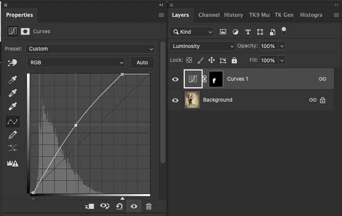
The face feels a bit lost in shadow, which can be an artistic choice, but I was curious if some lovely detail wasn’t hiding there. I painted on a soft-edged quick mask and used a curves to bring up the mid tones and hold down the darks. I moved the LL corner of the curve to the right just a bit to hold down the darkest darks in the eye. That made the colors too saturated so I changed the mode to Luminosity. (That doesn’t always work well and I often need to resort to adding a Hue-Sat layer to get it right.)
Diane, you are so right. I can add canvas on the left and will do so. Your explanation for bringing out the detail on the face is very clear. I am not comfortable using the curves adjustment. I need to push myself to use that tool. As always, your remarks are rich with encouragement and challenge. That is the talent of a good teacher. Thanks.
Barbara, this looks great! You’ve got a good look at this antelope, while the textures make for a fine dreamy sense. I like it’s off center placement, that’s a non-standard composition that adds well to the dreaminess.
Call me the odd man out however I much prefer the original rendition. The rework looks a bit bland to my eye. It had an emotional mood before that is lacking in the recent version. I guess it comes down to what you are happy with rather than what others think.
Beautiful work, Barbara. I like the reworked version with the brighter face and added canvas, but for me, I think I prefer the original vignetting. That’s just me though Incredibly well visualized and put together!